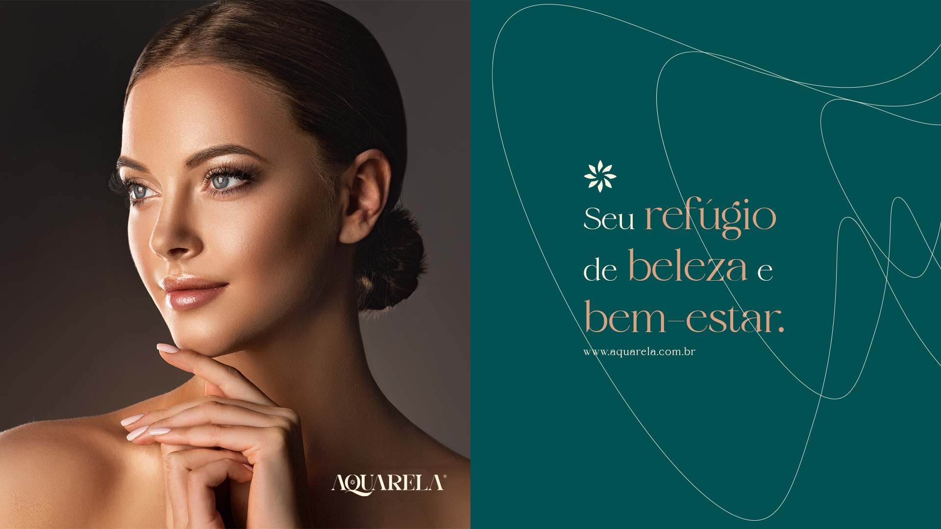
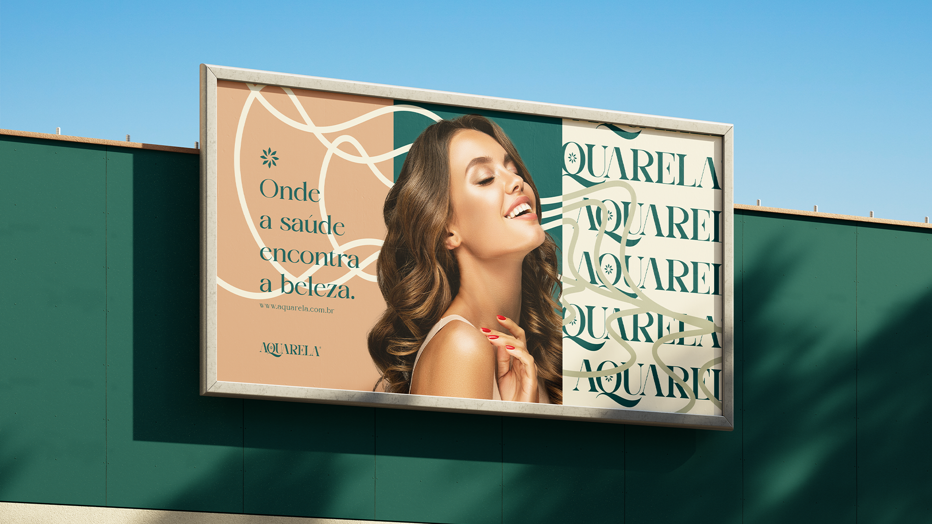
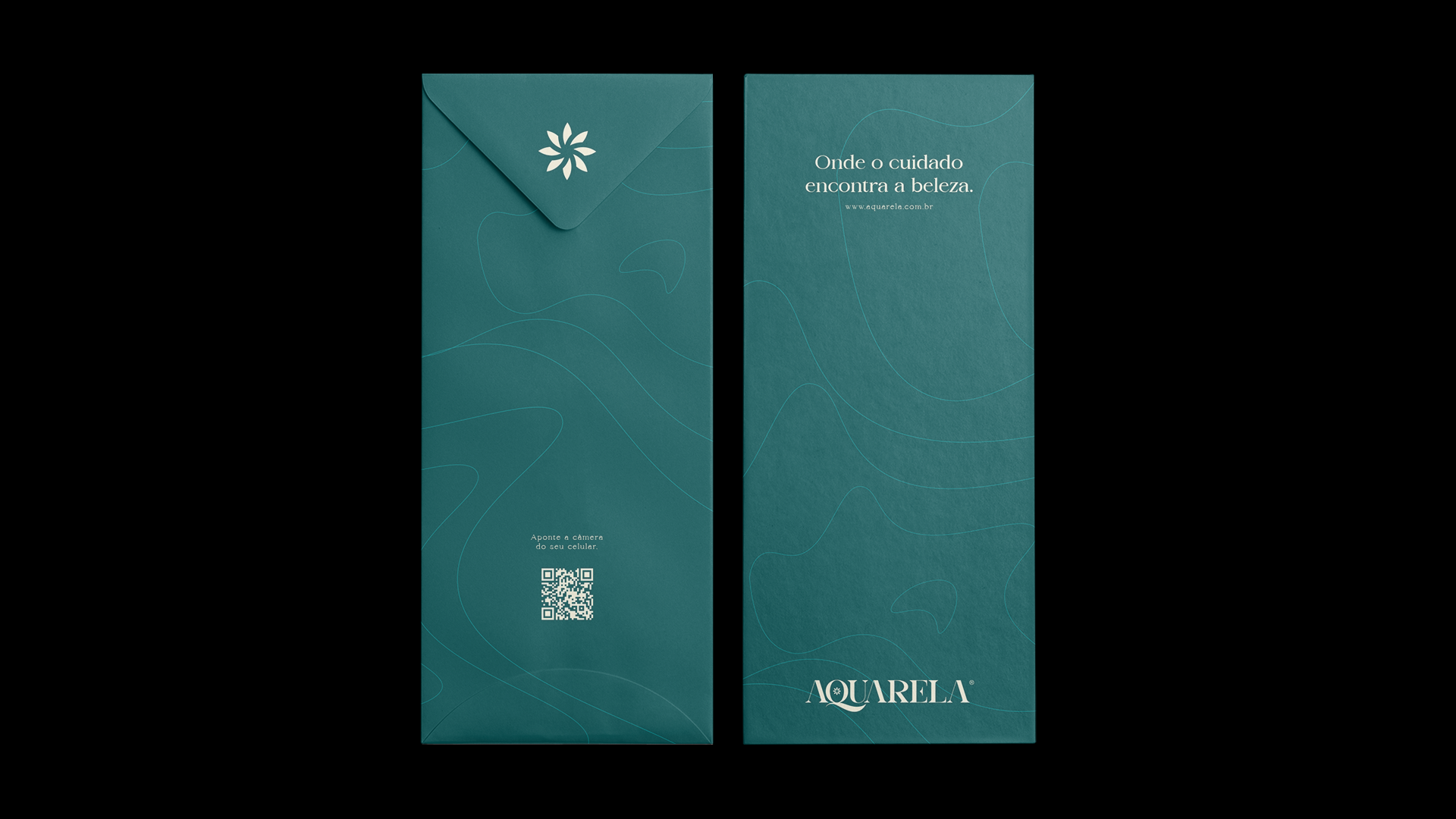
"Where care meets beauty."
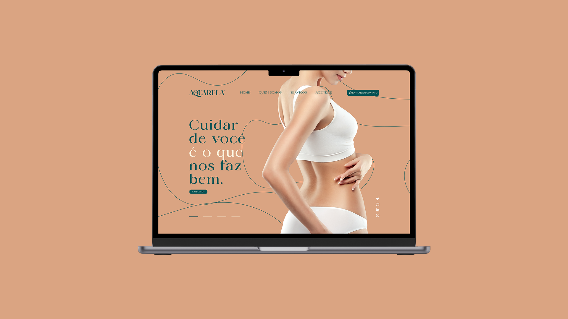
Aquarela is a beauty space located in the state of Rio Grande do Sul in Brazil. With a new, even more premium proposal, the Aquarela team approached me to create a project that was in line with the quality of their new space.
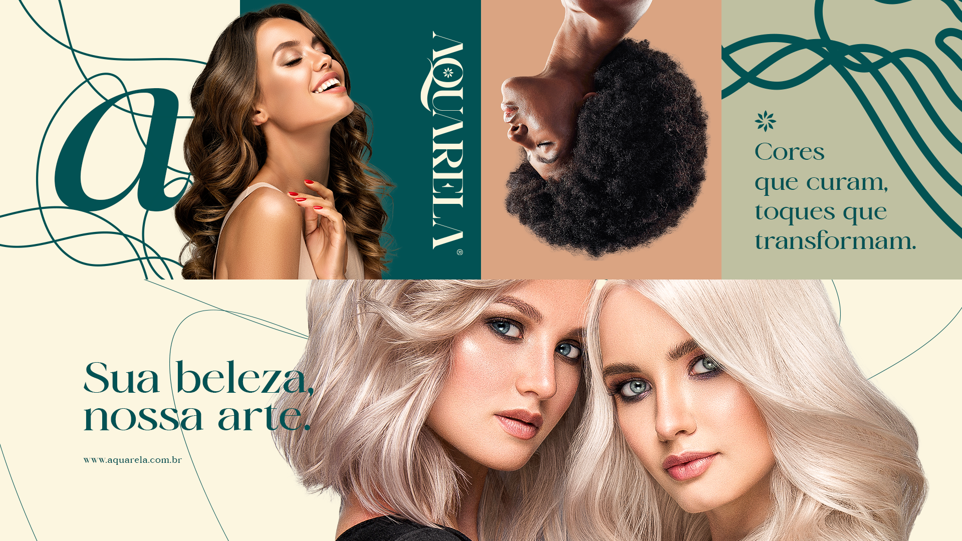
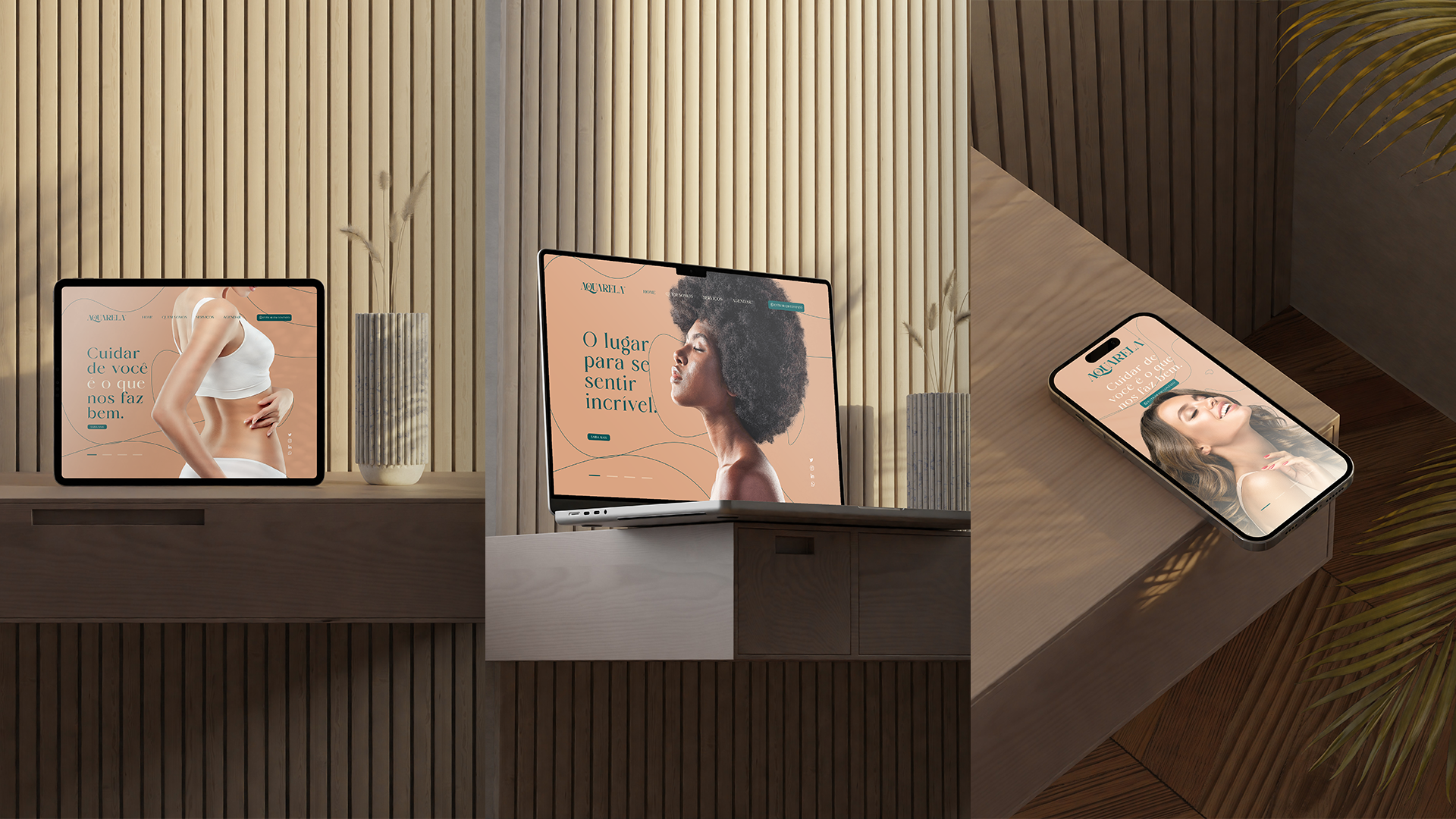
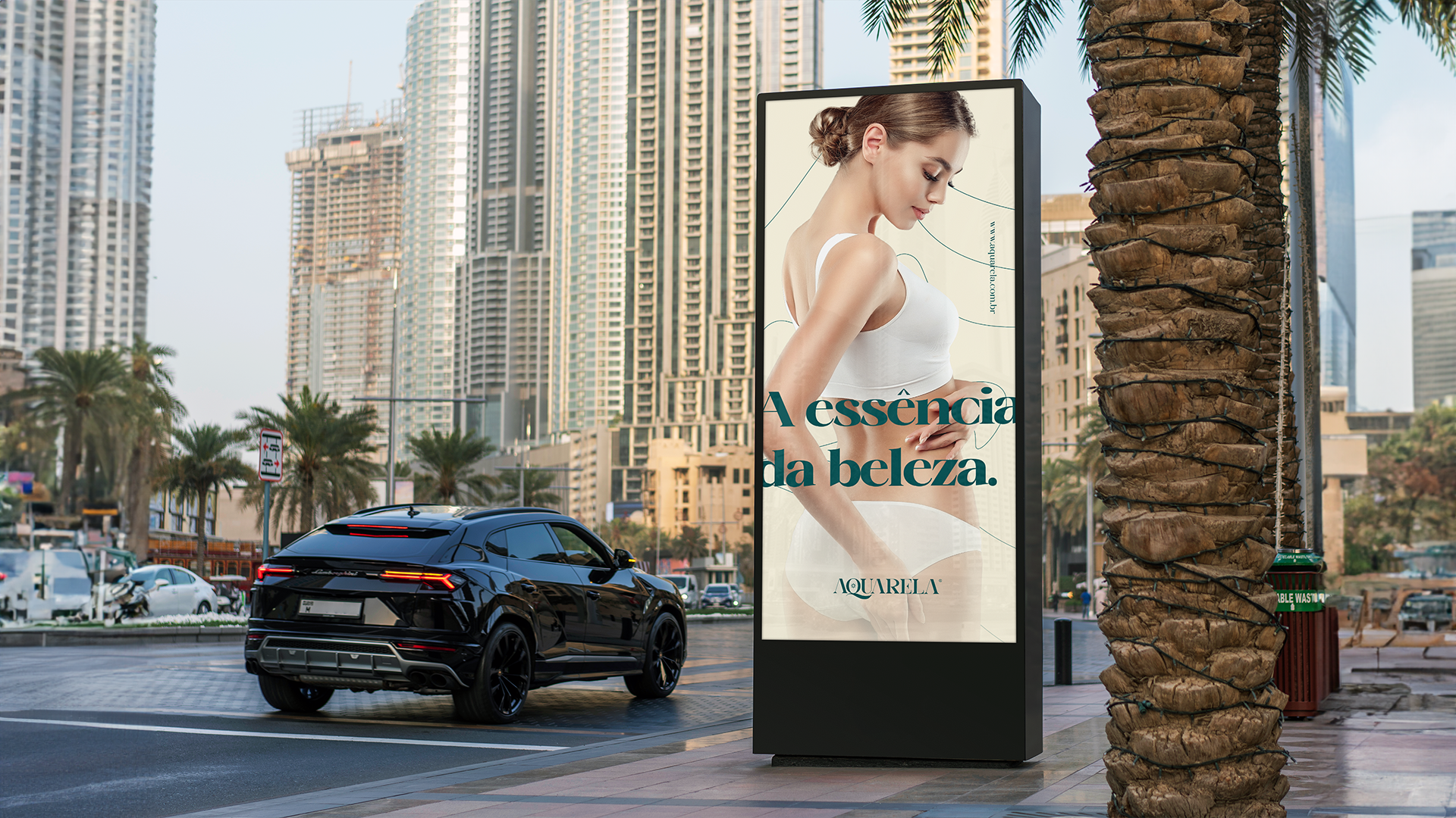
The space aims to reach the high-end female audience, and make these customers permanent and recurring.
I created a strategic brand that spoke to this audience and reached them, making them consume the brand and want it.
Good presentation to everyone.
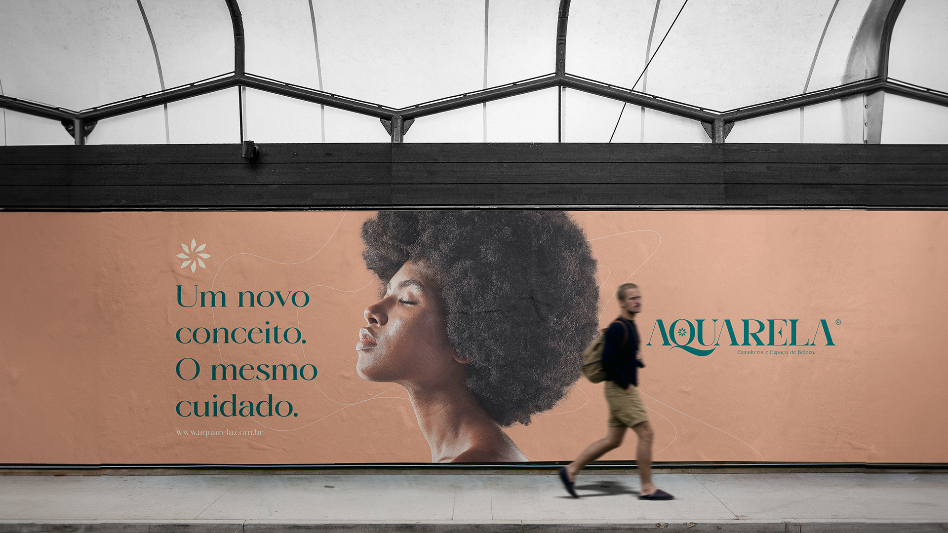
"A new concept. The same care."
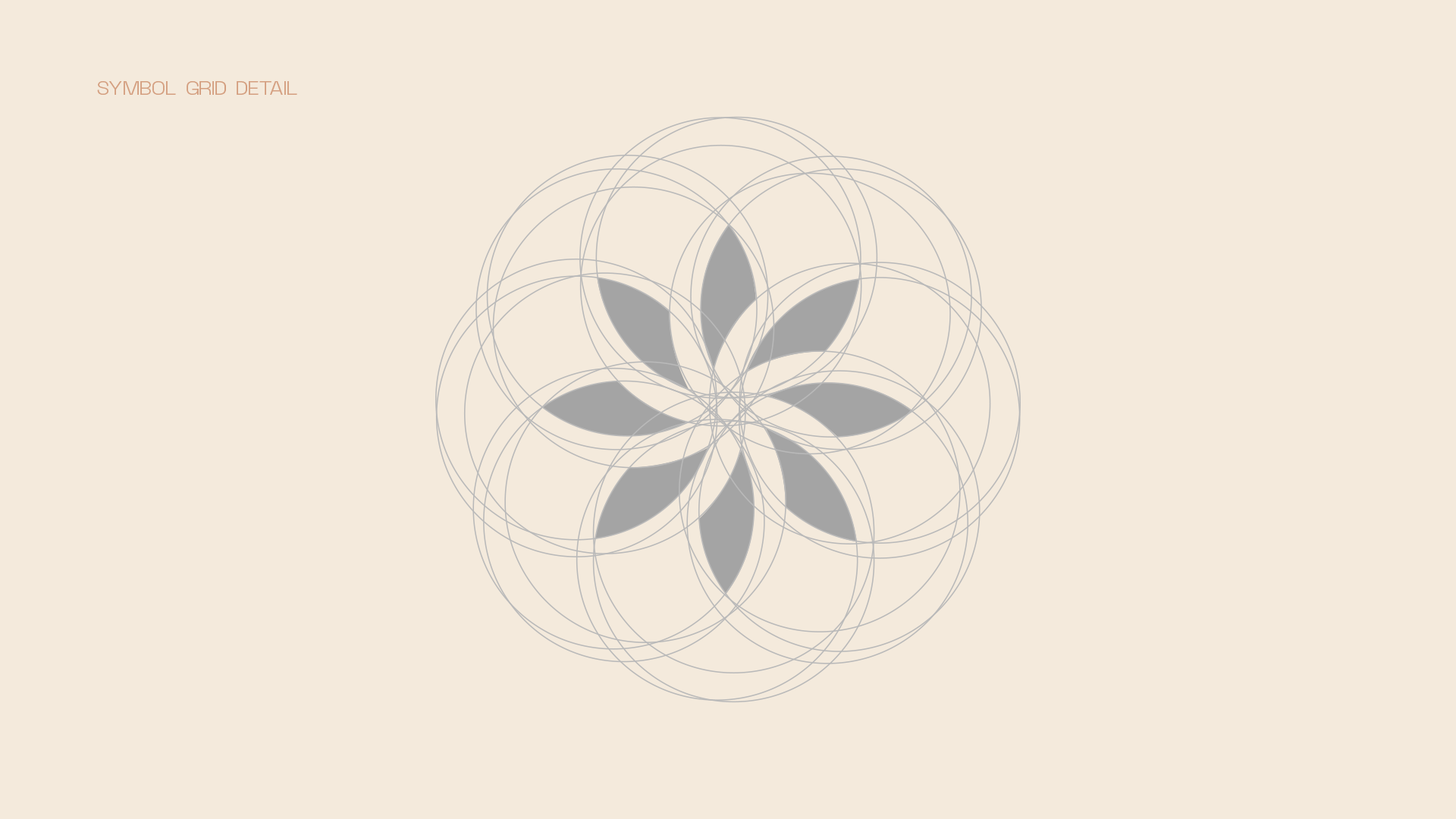
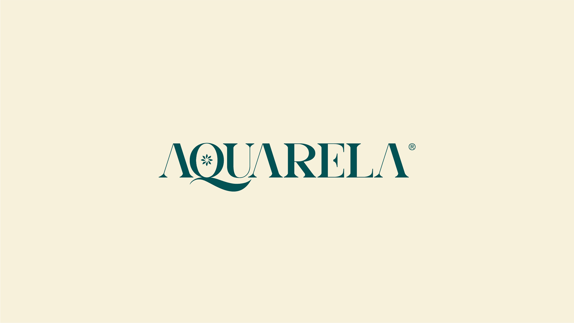
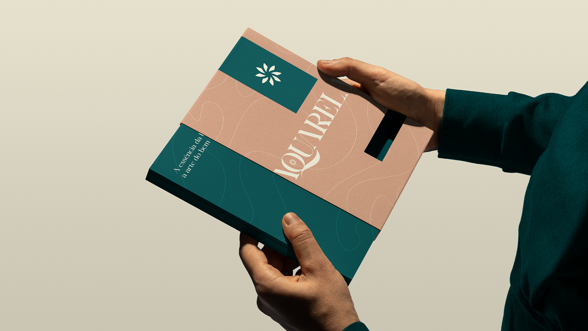
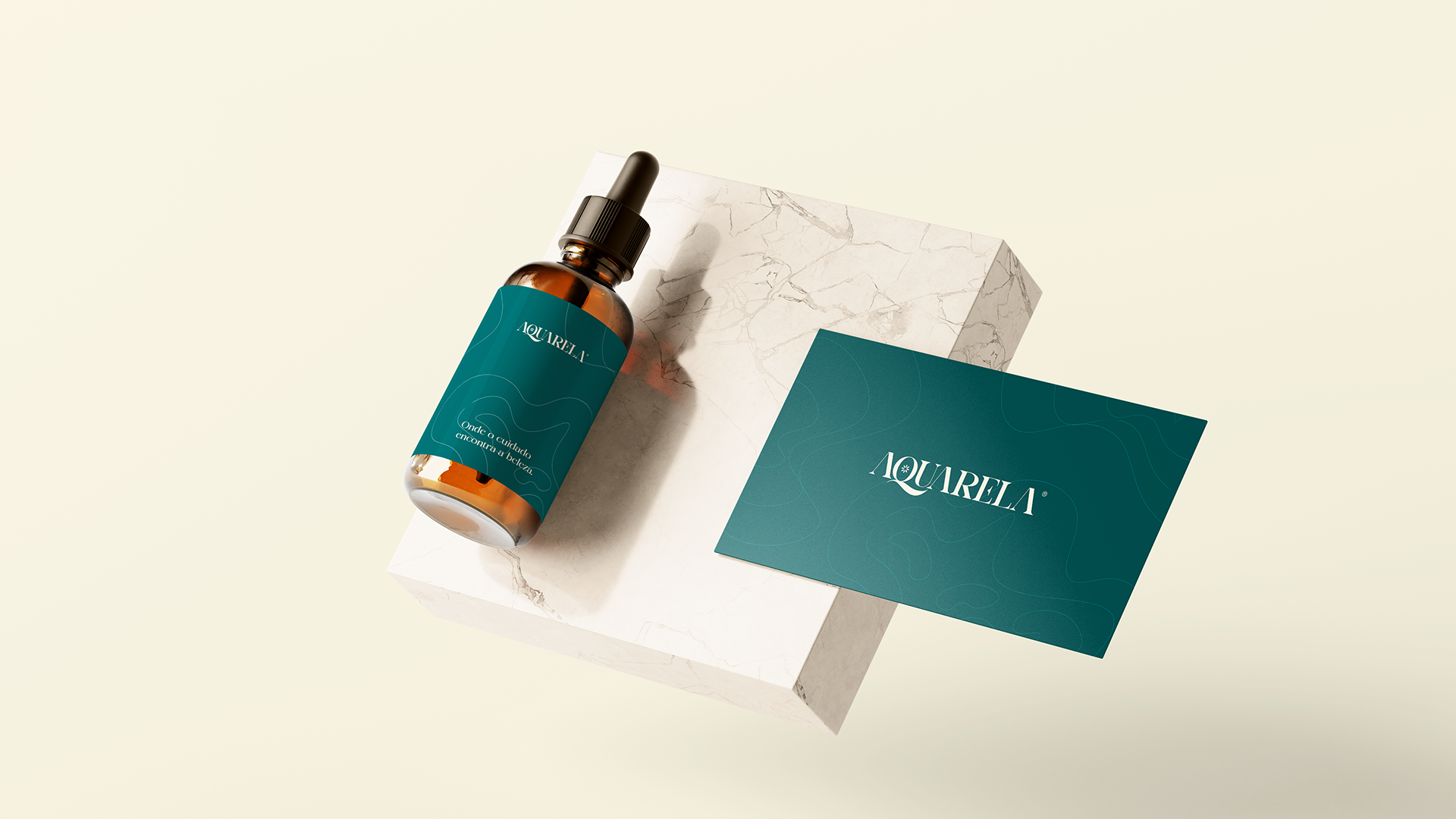
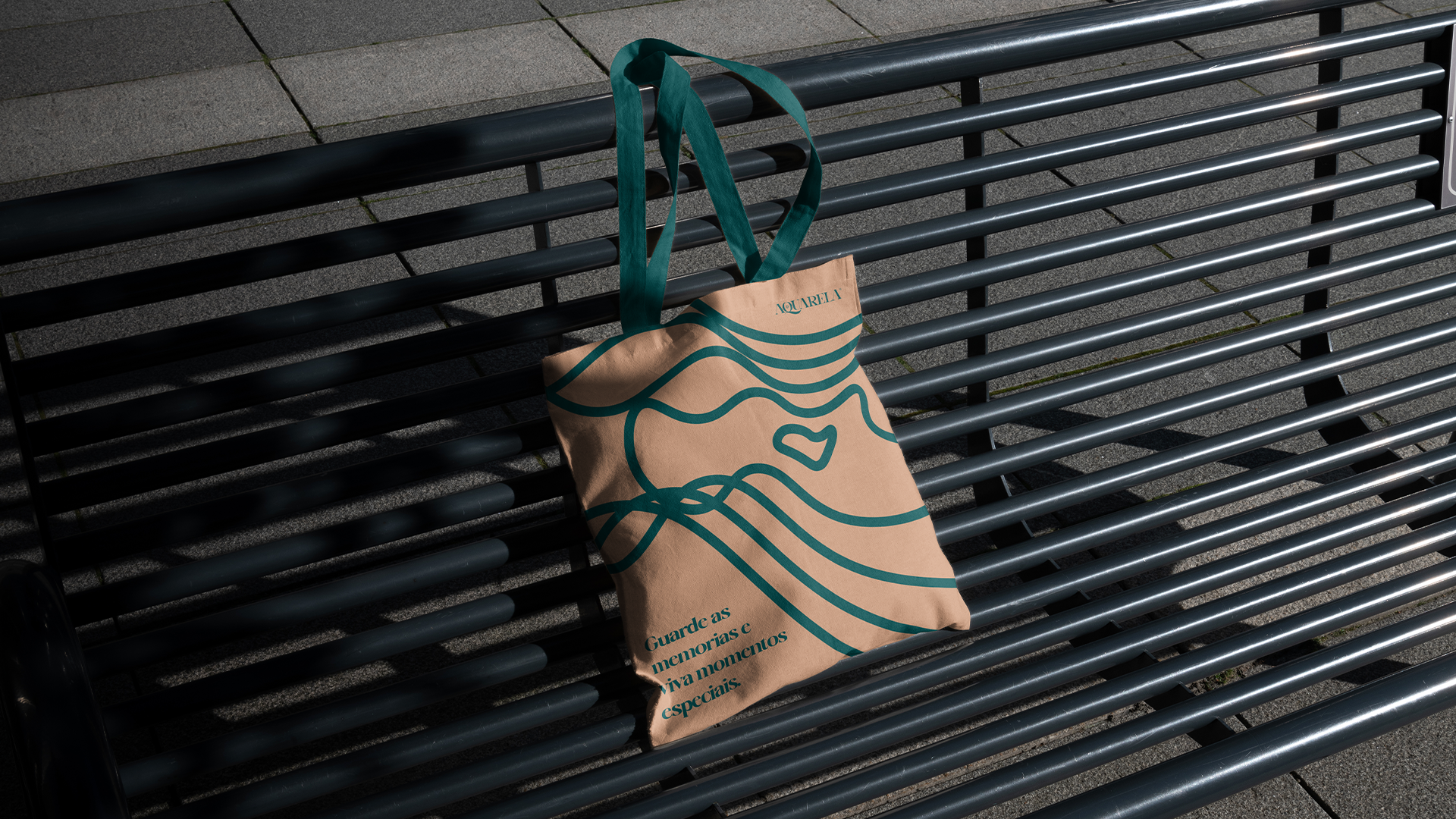
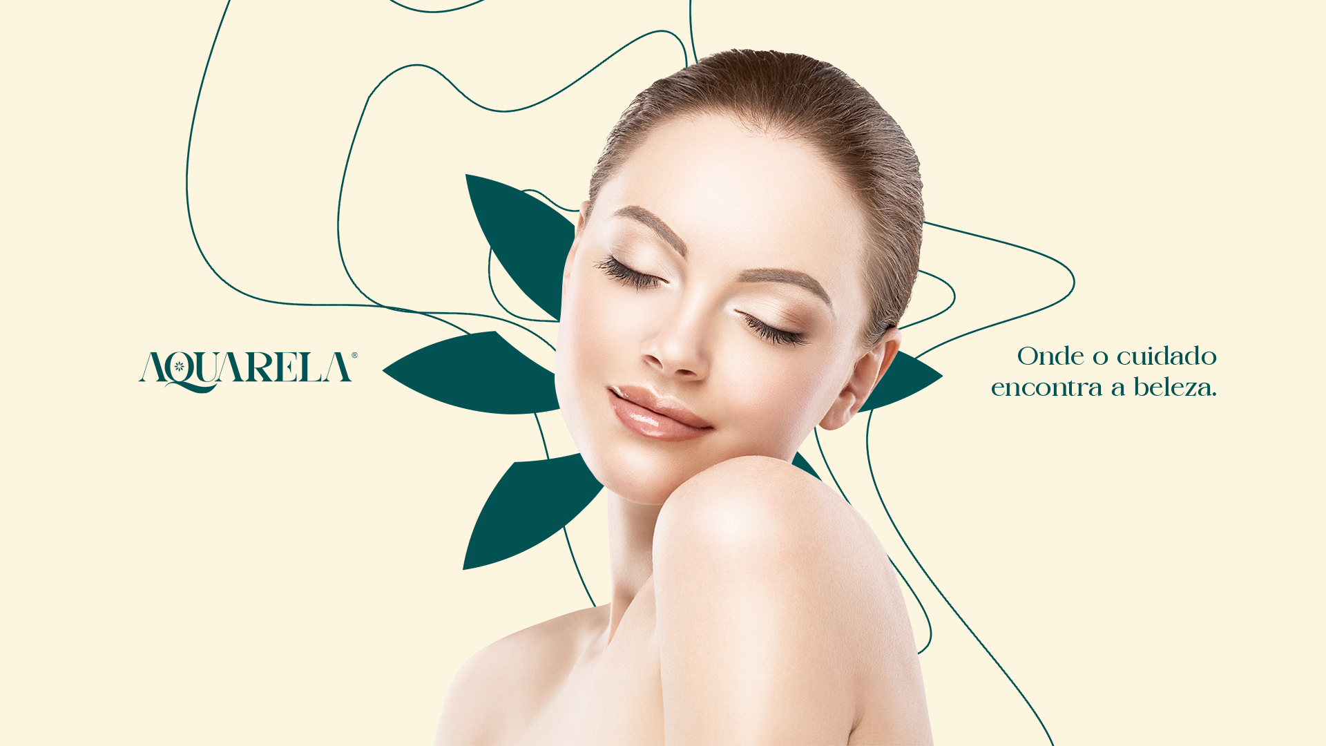
To create the symbol, I combined things that I believe are essential for a project like this. The name of the brand being Aquarela immediately directed me to the idea of brushes, so I thought about creating a flower, combining both ideas we have several brushes (from watercolor) forming a beautiful flower.
The symbol proves to be sober and maintains the feminine idea of the project and achieves softness in a unique way. With the grid I kept all the nuances and created a cohesive and harmonious symbol.
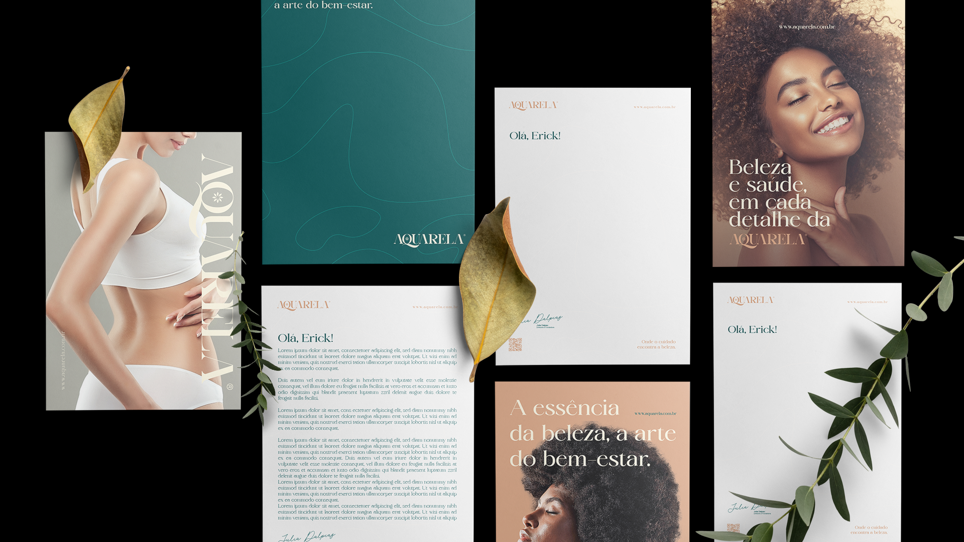
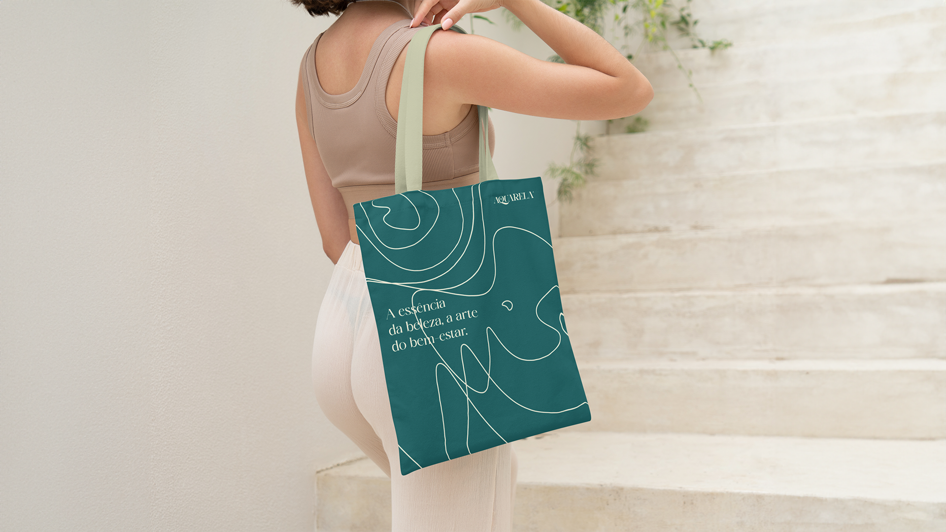
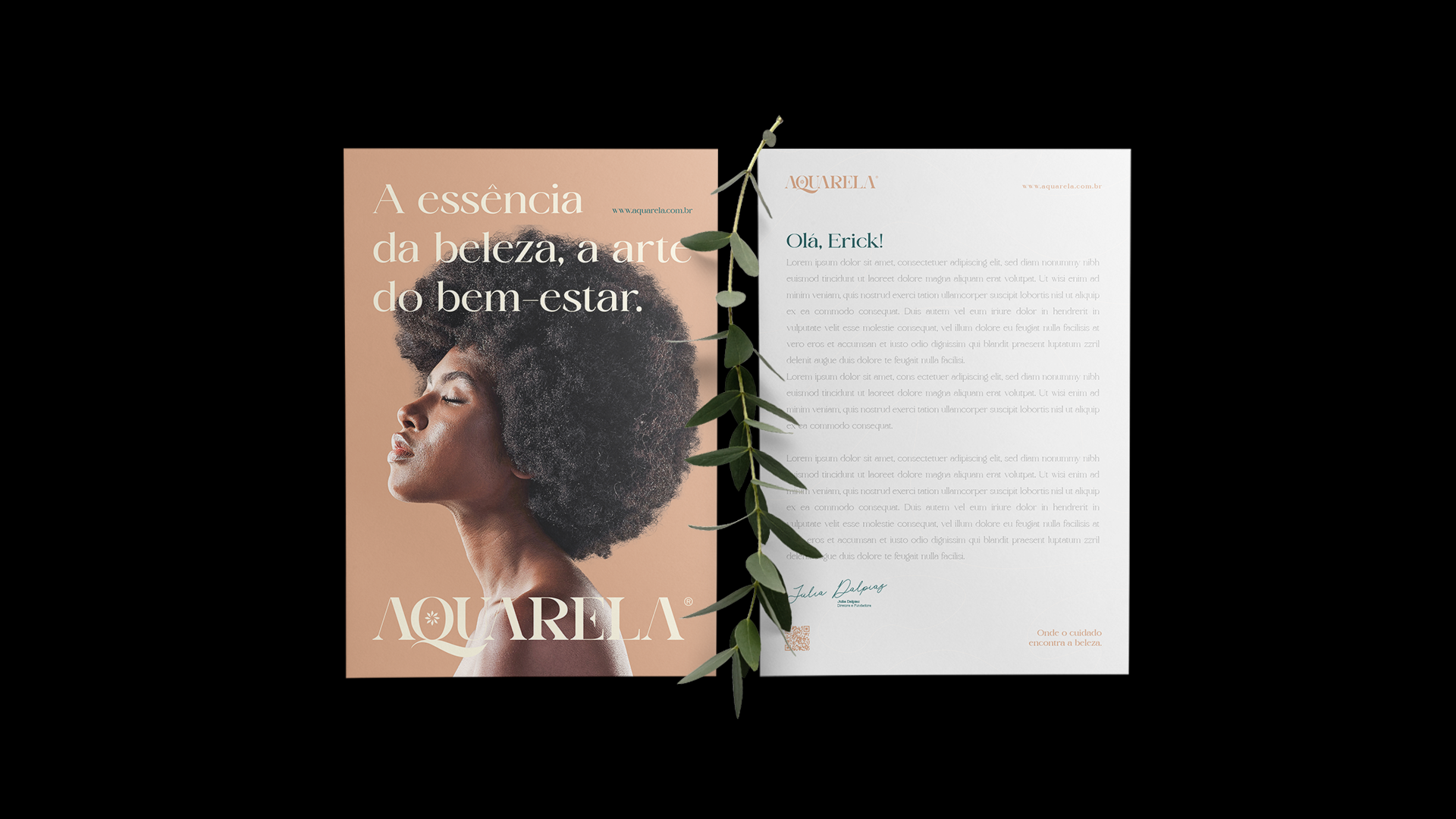
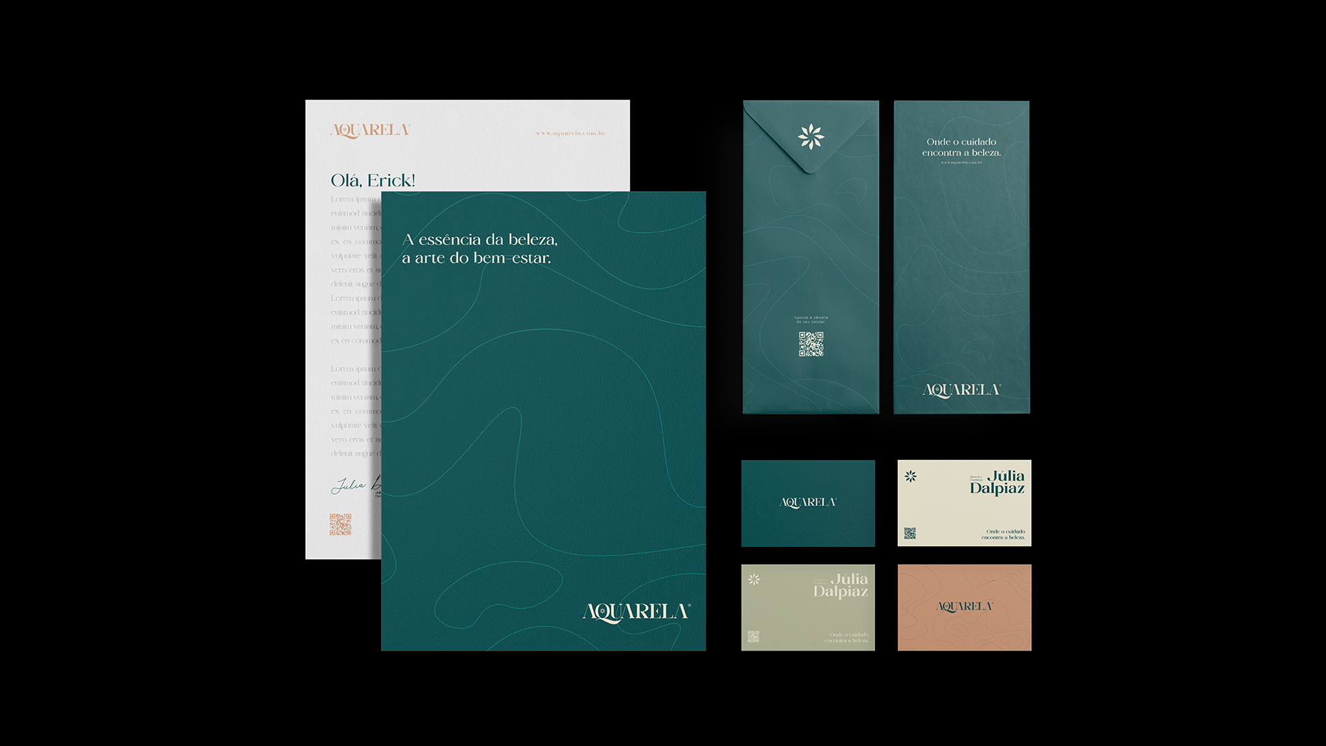
"The essence of beauty, the art of well-being."
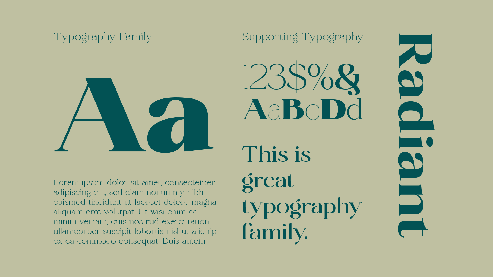
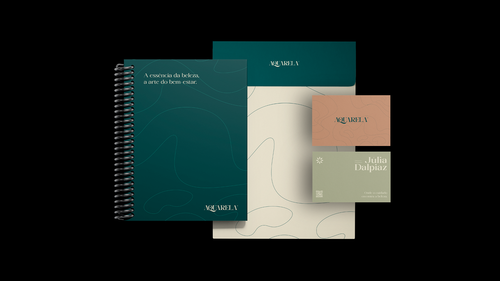
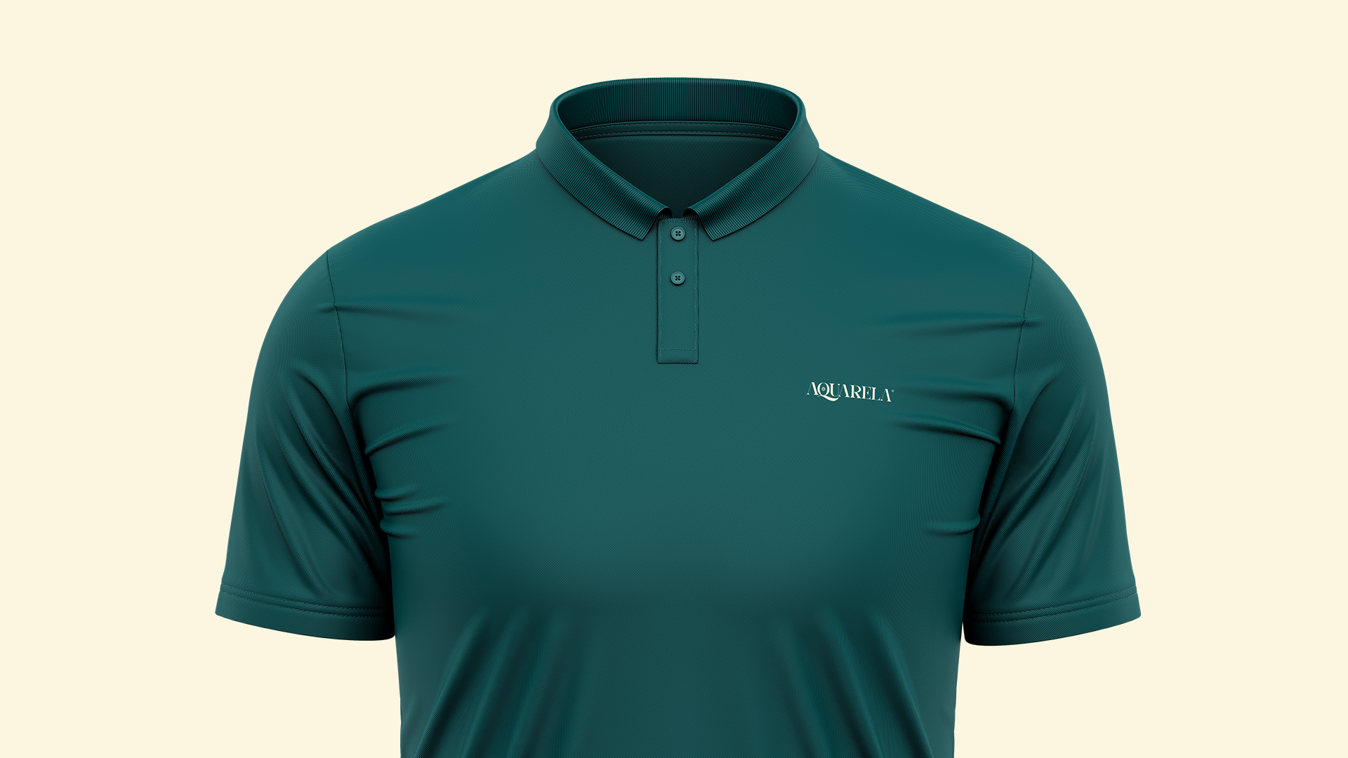
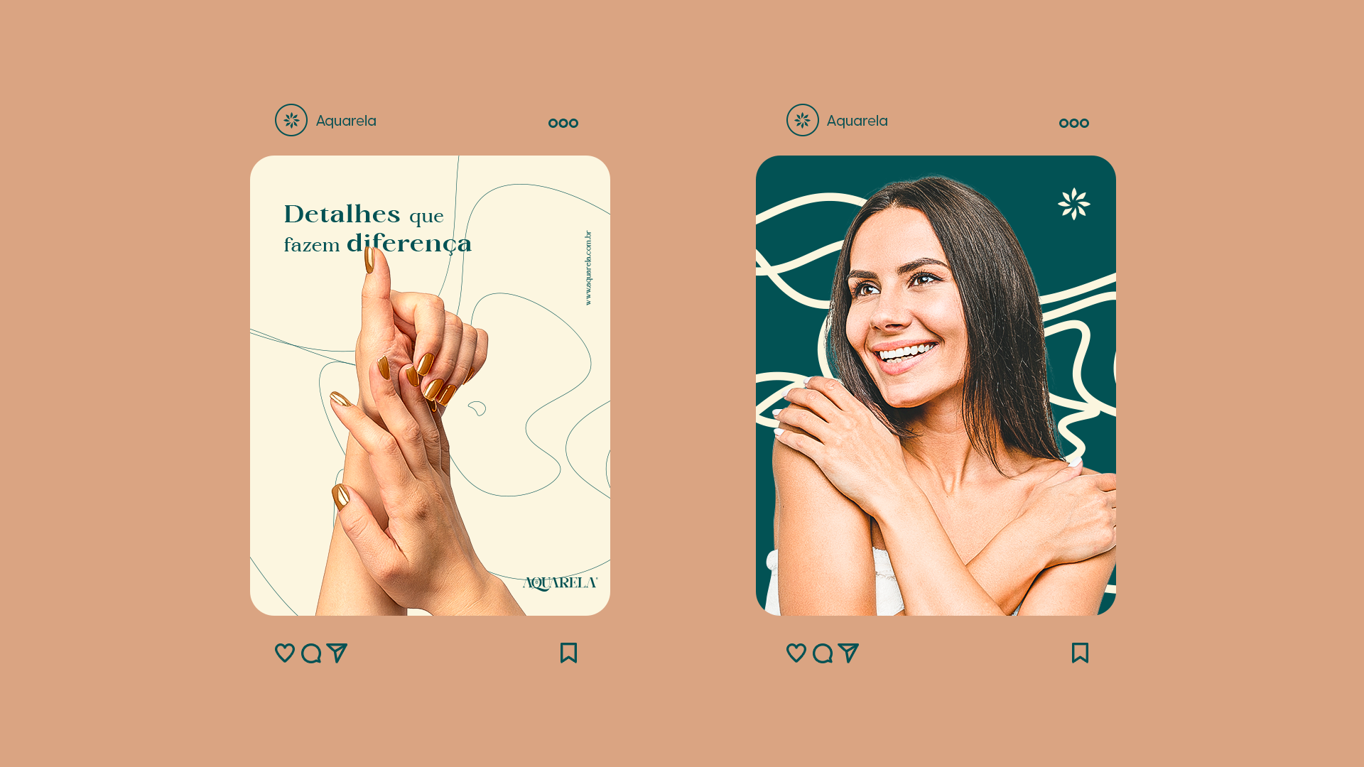
For the brand's typography I used the Radiant Charisma font. With a huge variation of styles and thicknesses, Radiant is extremely versatile and can be applied to small and large, long and short texts with extreme ease as seen in the example above.
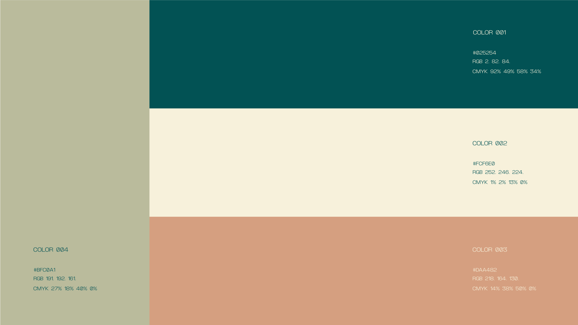
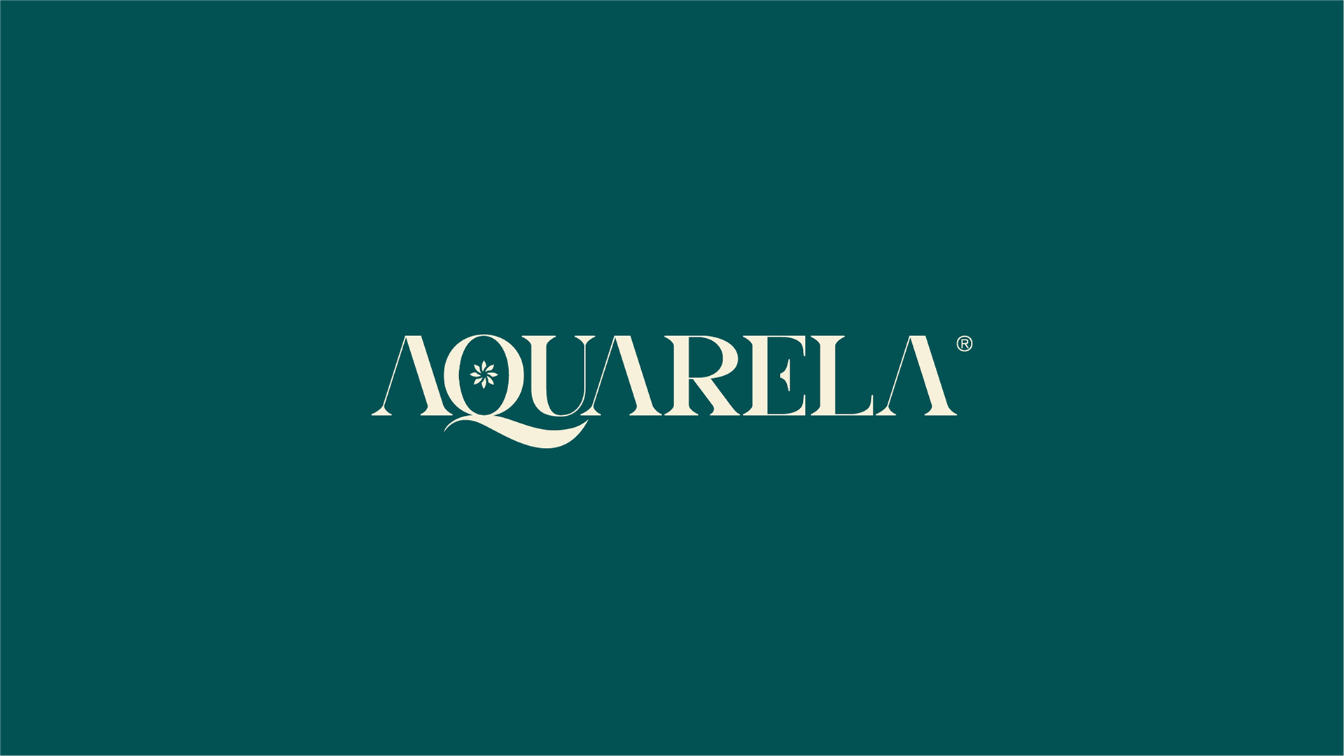
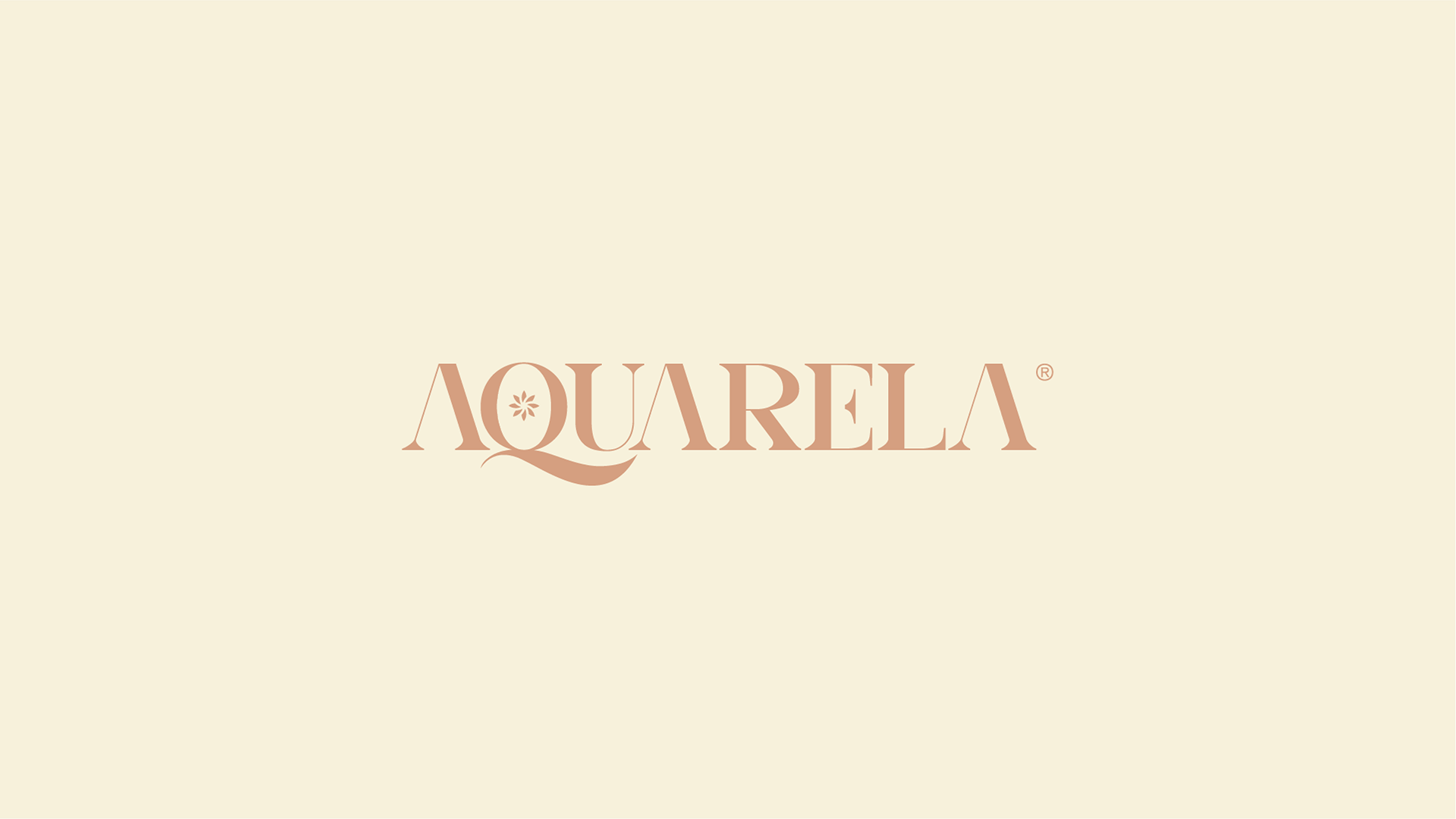
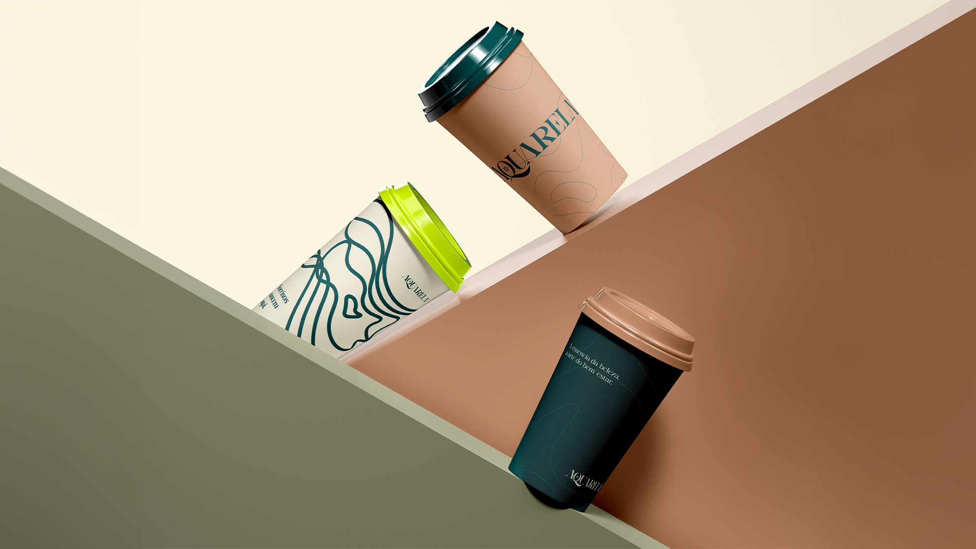
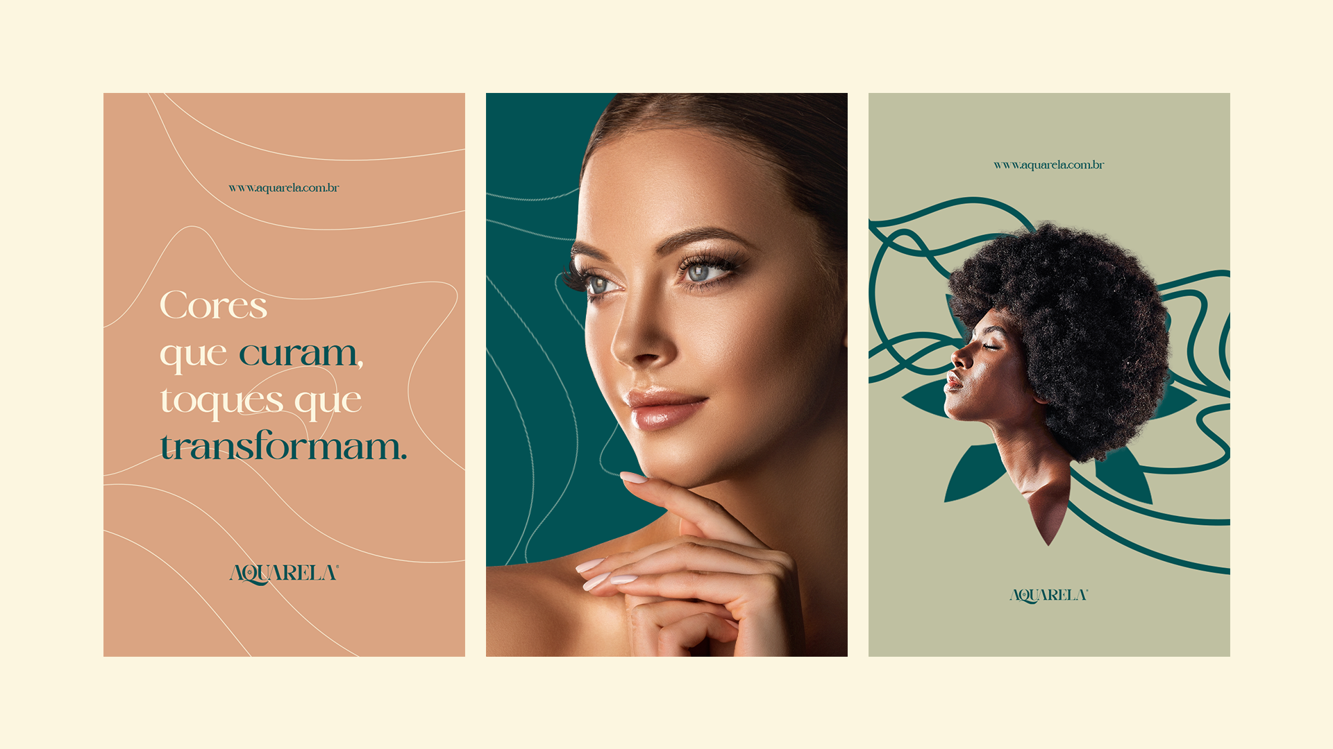
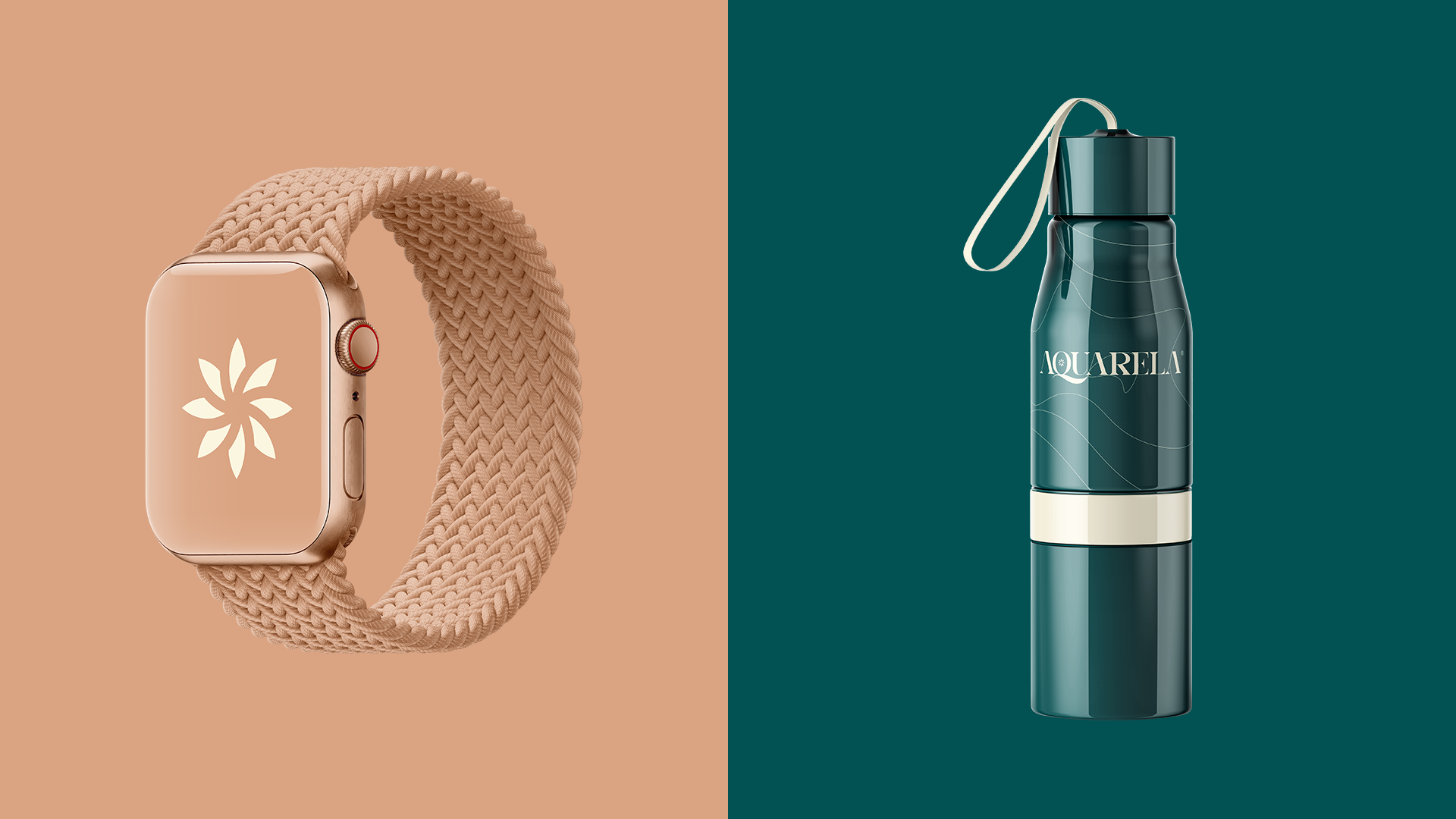
For the colors, we use shades of green and shades of brown in agreement with the client, considering that the company has many connections with nature and natural products, and these colors are in accordance with the colors already in the client's establishment.
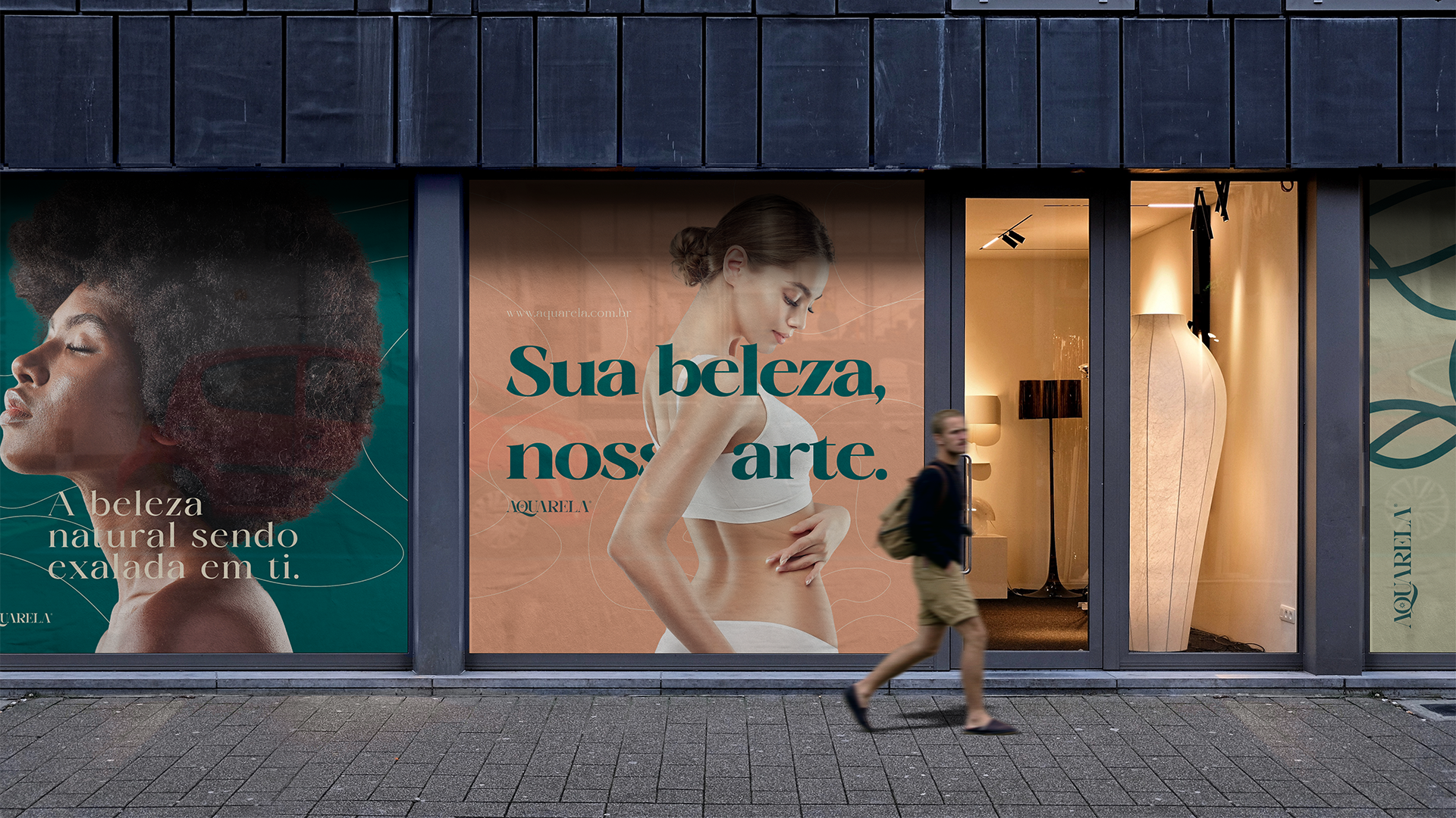
"Your beauty, our art."
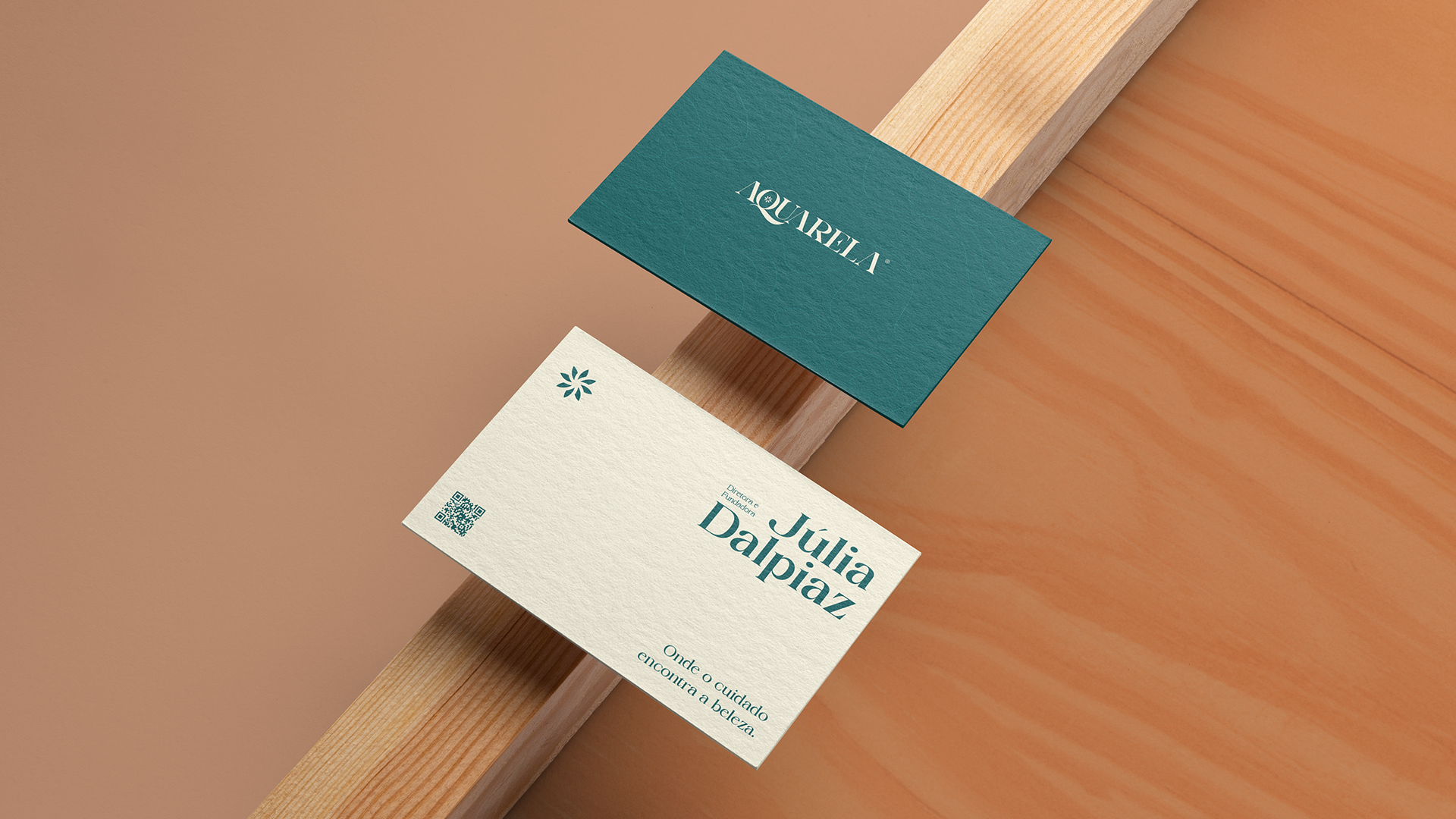
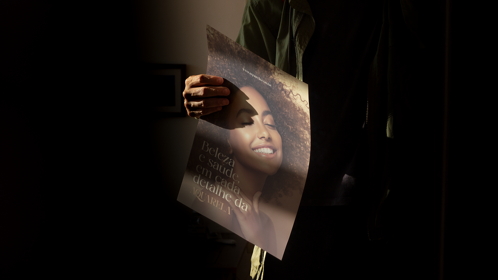
As a final result, we have an extremely detailed brand, which conveys all the main attributes of the brand, which manage to convey a brand rich in details and care.
This result was approved by my client and I hope it pleases everyone.
See more: https://erickmutti.com/