We transform ideas into experiences.
Januzzi is a renowned audiovisual production company based in Rio de Janeiro, Brazil. Dedicated to producing excellent productions, our company stands out for its unique combination of the tradition of cinematographic legacy and the cutting edge of contemporary technology. Our commitment is to provide customers with cinematic experiences that transcend expectations, always aiming to achieve excellence and have a profound impact on the target audience.
Concept.
This project was designed with the purpose of evoking strength, elegance and modernity. With this vision in mind, I opted for a minimalist approach that highlights the brand's identity in all its applications. Through contemporary typography and a representative symbol, I sought to convey these attributes in a consistent way.
The brand aspires to instill such feelings in its target audience from the first visual contact. Therefore, I paid special attention to selecting typography and colors that reflected these values, as will be detailed below.
Logotype.
The concept behind the logo design is to synthesize the brand's mission, reconciling the richness of past experience with the vitality of the present, thus symbolizing its fusion between tradition and modernity.
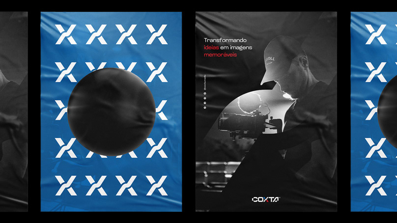
With this purpose in mind, I developed a symbol that abstractly evokes an old camera, integrating the iconic play (▶️) and pause (⏸️) buttons in an overlapping manner, suggesting a harmonious convergence between legacy and contemporary times.
The result is a distinctively minimalist and contemporary symbol, whose versatility allows it to be applied to a wide range of materials and contexts. As for the brand name, an exclusive typography was created for the project, ensuring its uniqueness and visual cohesion that sets it apart from the competition.
Visual Identify.
Color choices played a key role in creating a remarkably contemporary and cohesive brand. These distinct nuances offer a breadth of application possibilities, each unique in its own essence. This approach is what truly distinguishes a successful brand from a simple conventional logo.
The typography selected to represent the brand is Altersan, recognized for its legibility and versatility. This typographic family offers an impressive variety of weights and styles, always ensuring the best reading experience in any context.
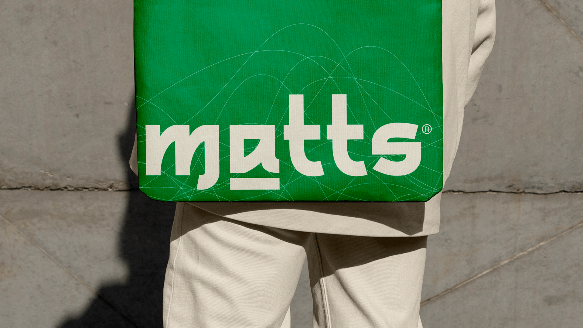
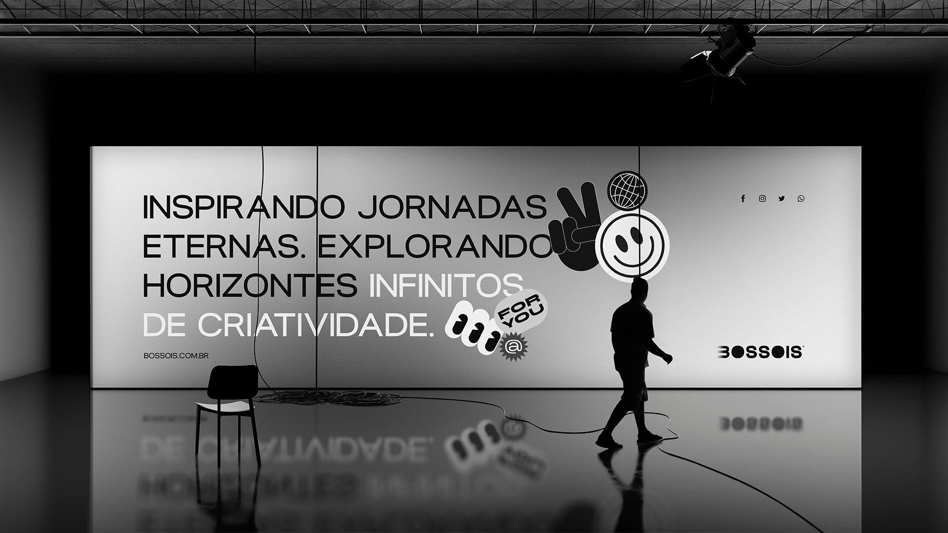
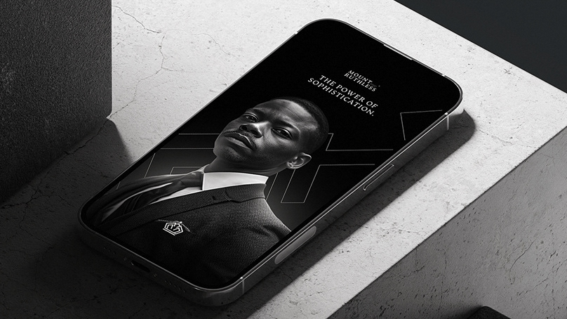
The applications, both physical and digital, were meticulously aligned with the brand's essence and proposal, resulting in perfect harmony. I sincerely hope that this project is to your liking and meets your expectations.
