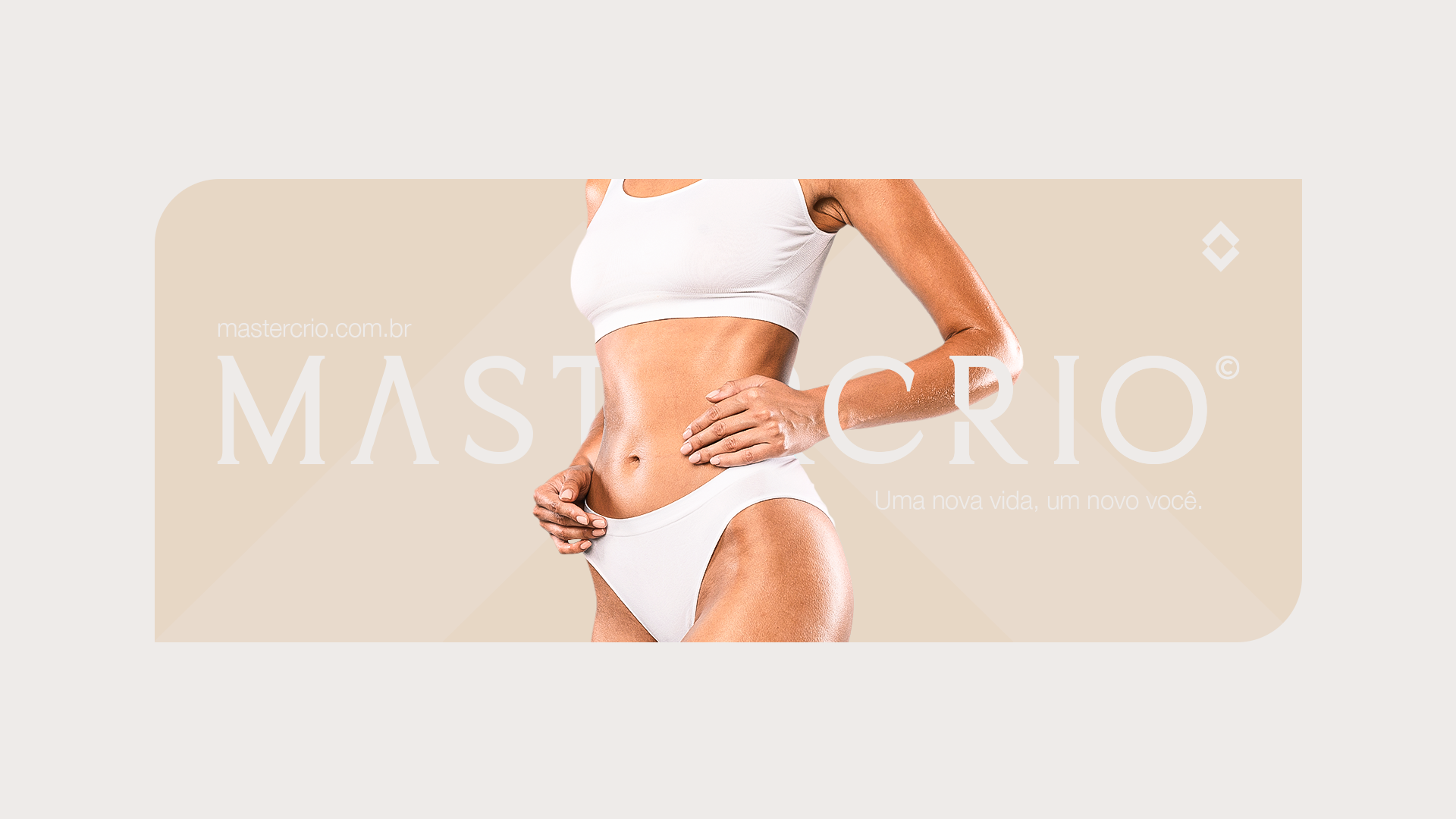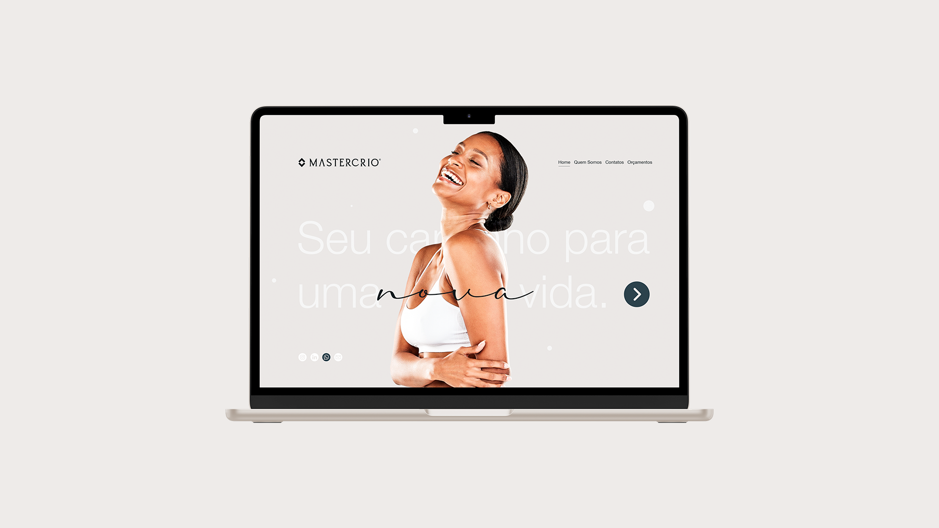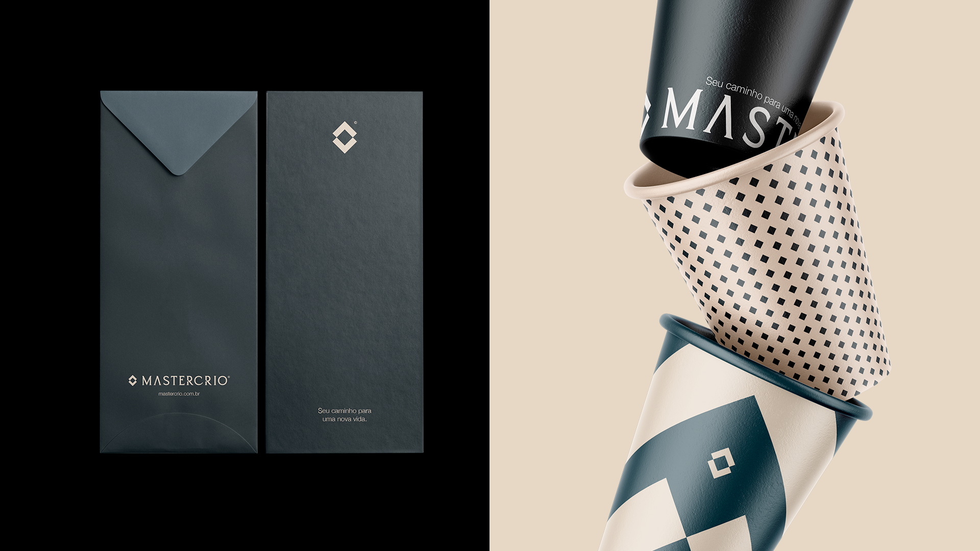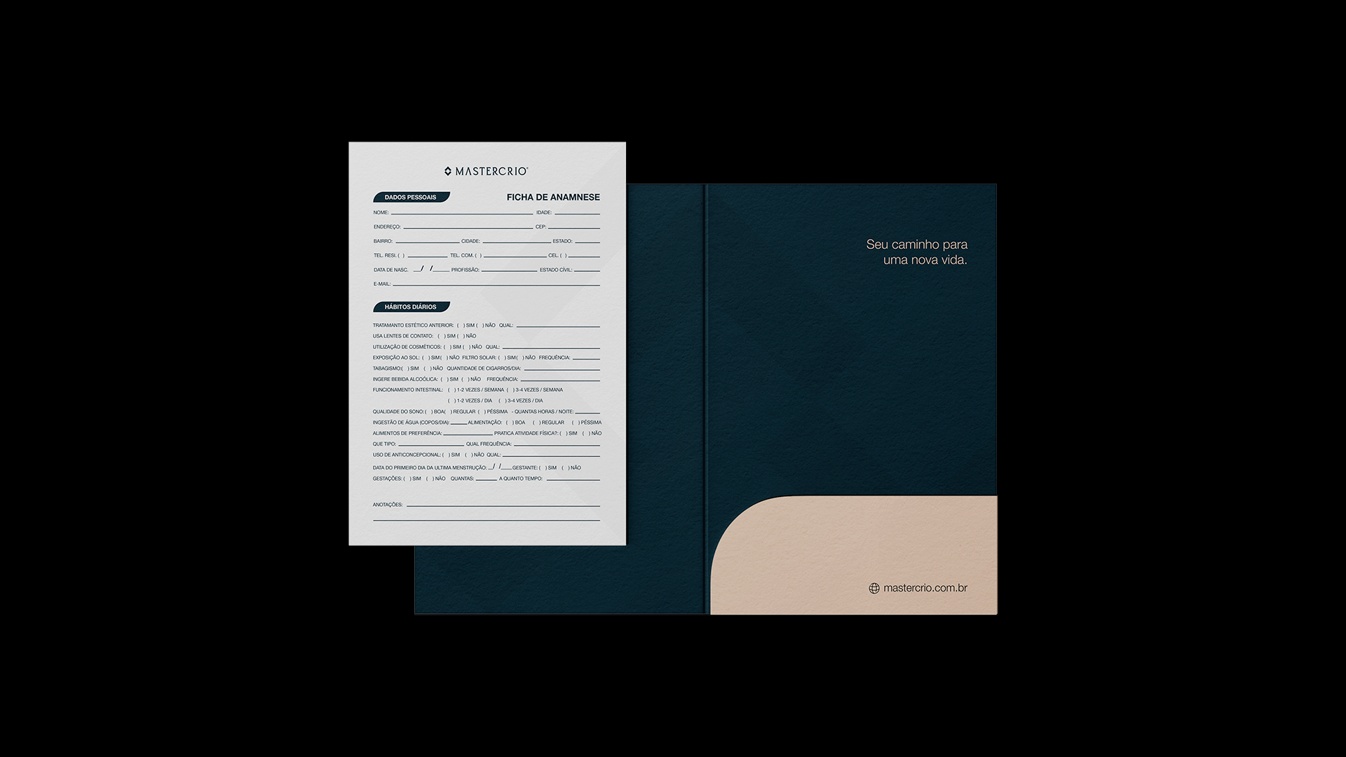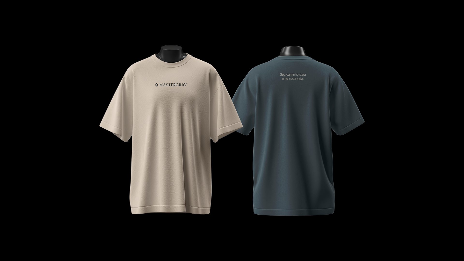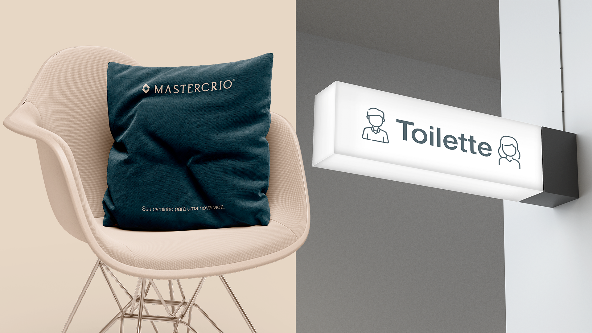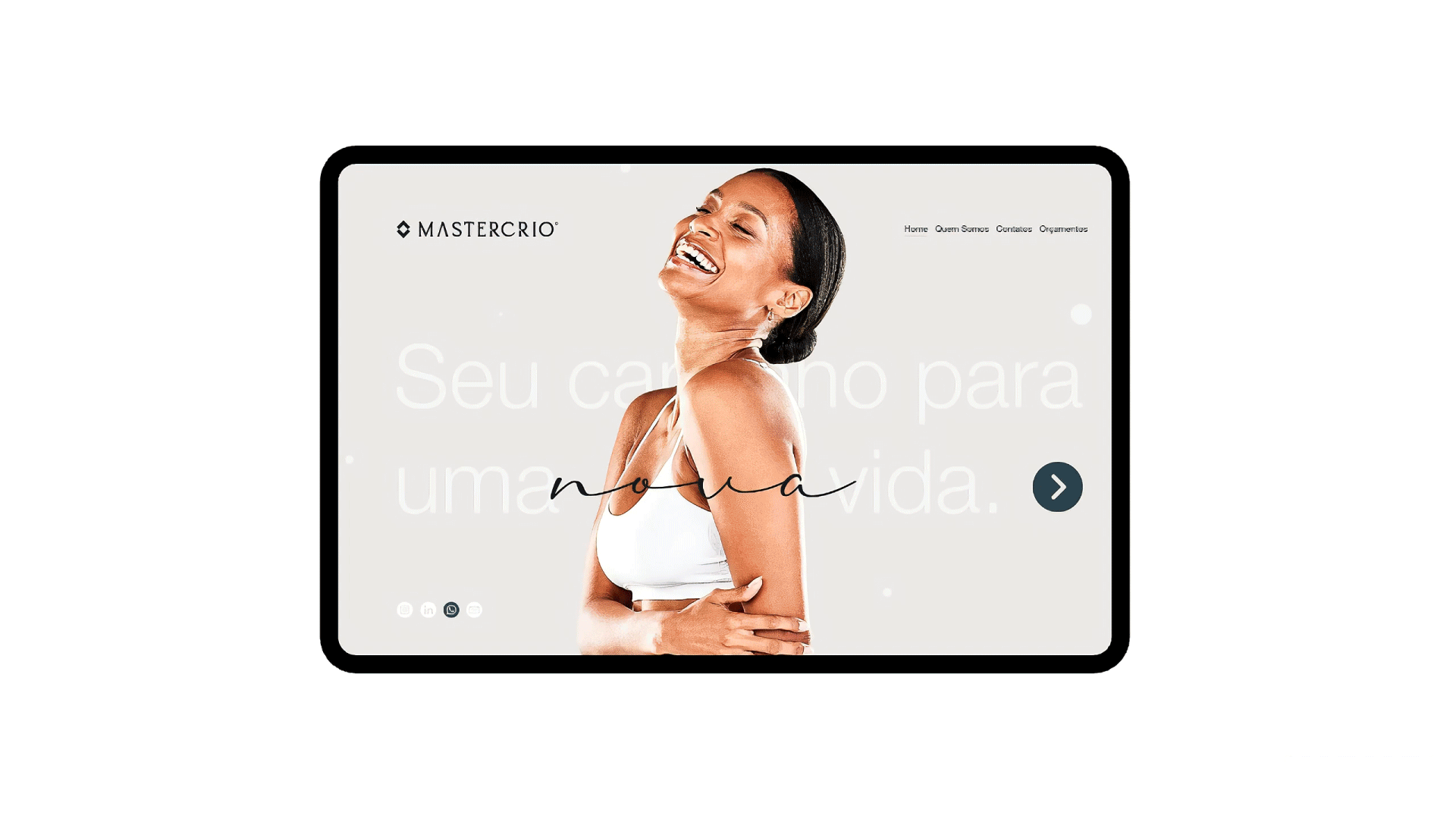
Your path to a new life.
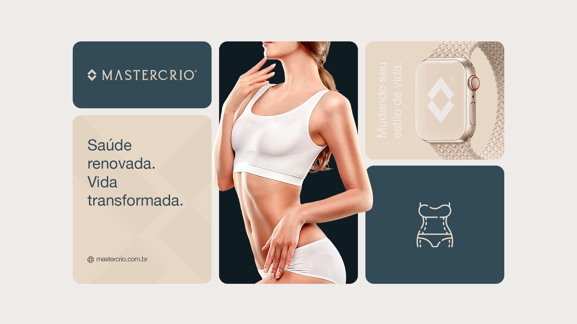
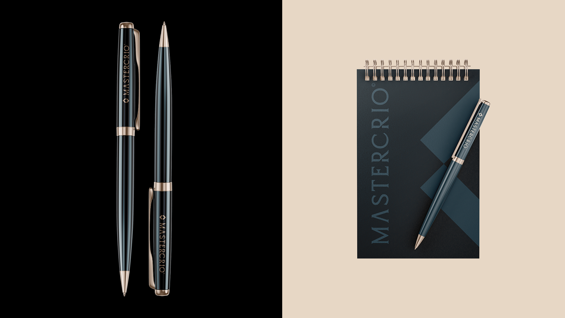
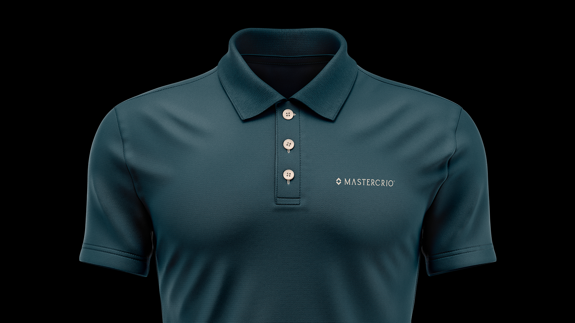
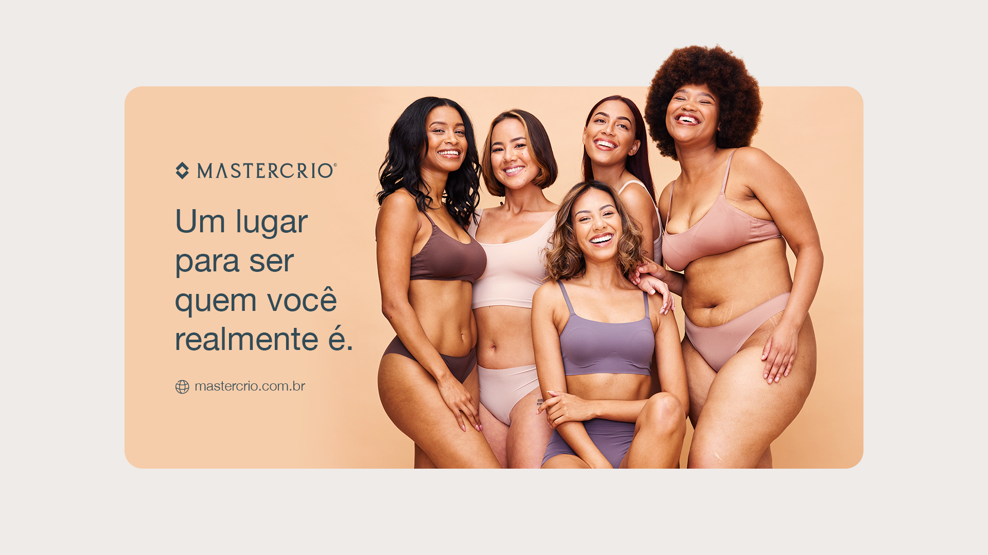
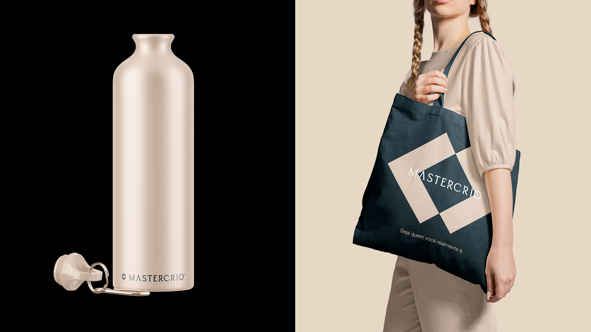
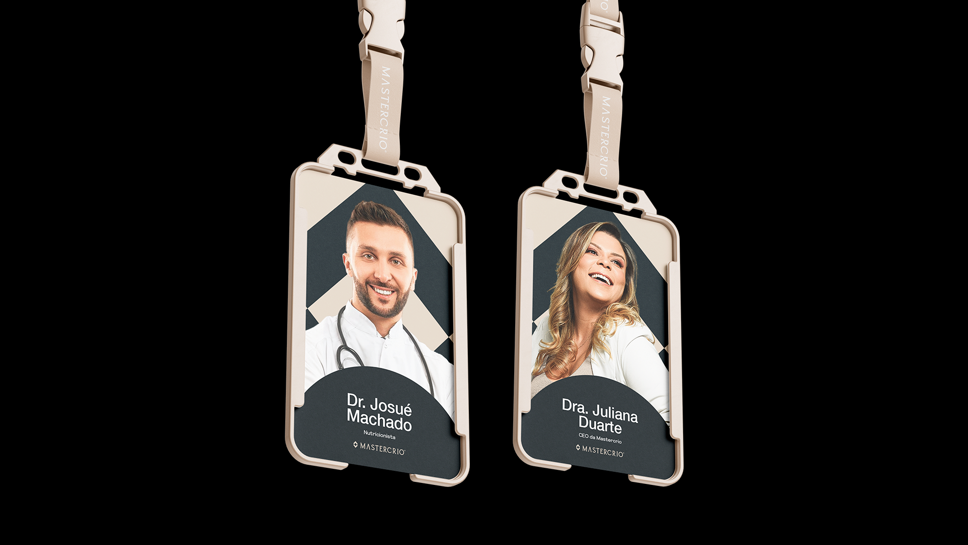
Mastercrio is an aesthetics clinic, specialized in improving the physique of its patients. With a modern and minimalist proposal, the company's idea was to carry out a total rebranding, symbolizing the new era the company is entering.

The typographic family.
We chose the Helvetica Neue typography because we believe it is an extremely versatile font that communicates exactly what the brand wants to convey to its customers. Modernity, lightness and sophistication.

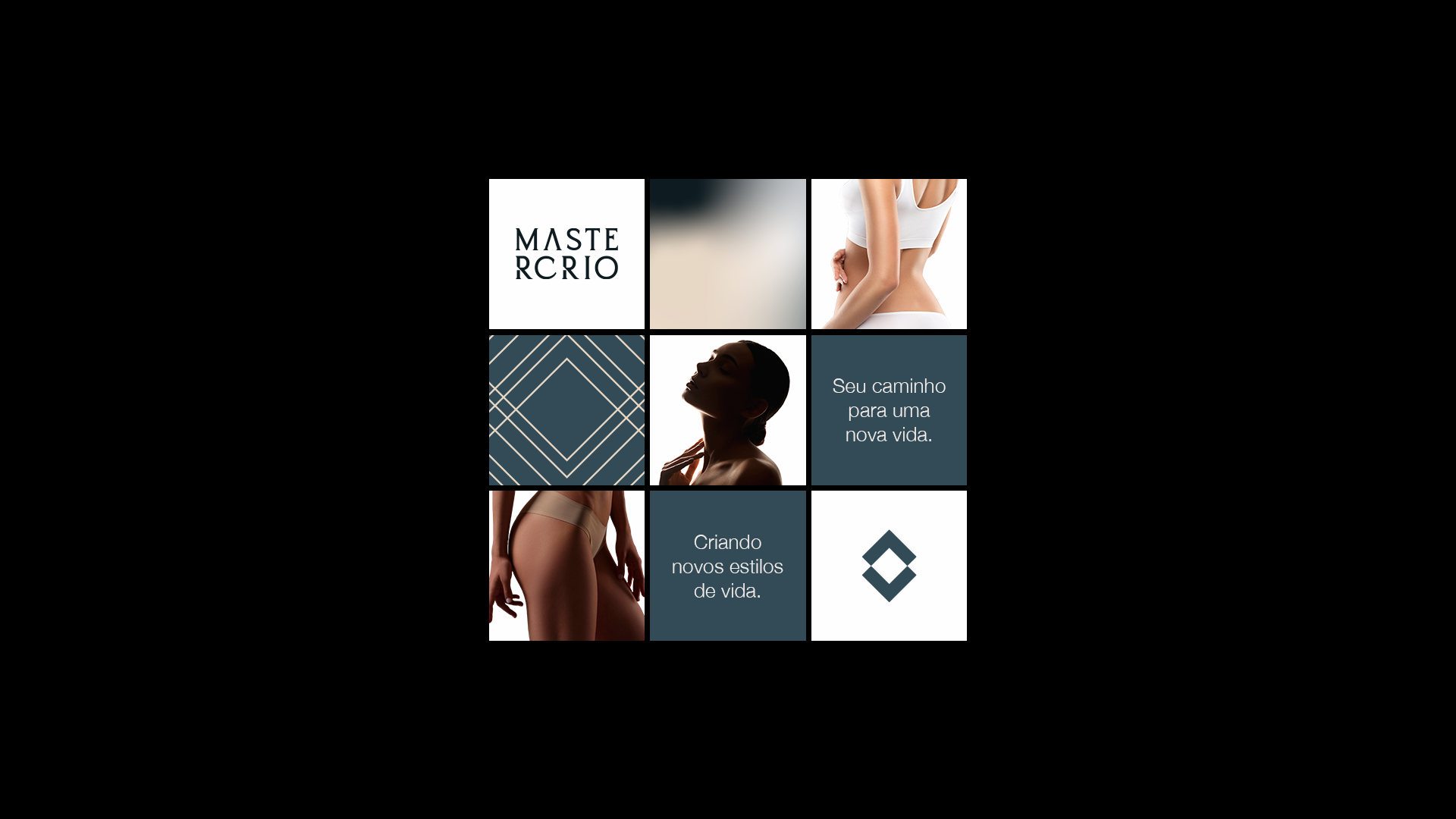
The colors.
These are the brand's colors, they accurately communicate the brand's new era and everything it wants to convey. Going completely against the colors that are countless times used in the market, with darker tones, we managed to create something feminine and that conveys delicacy.

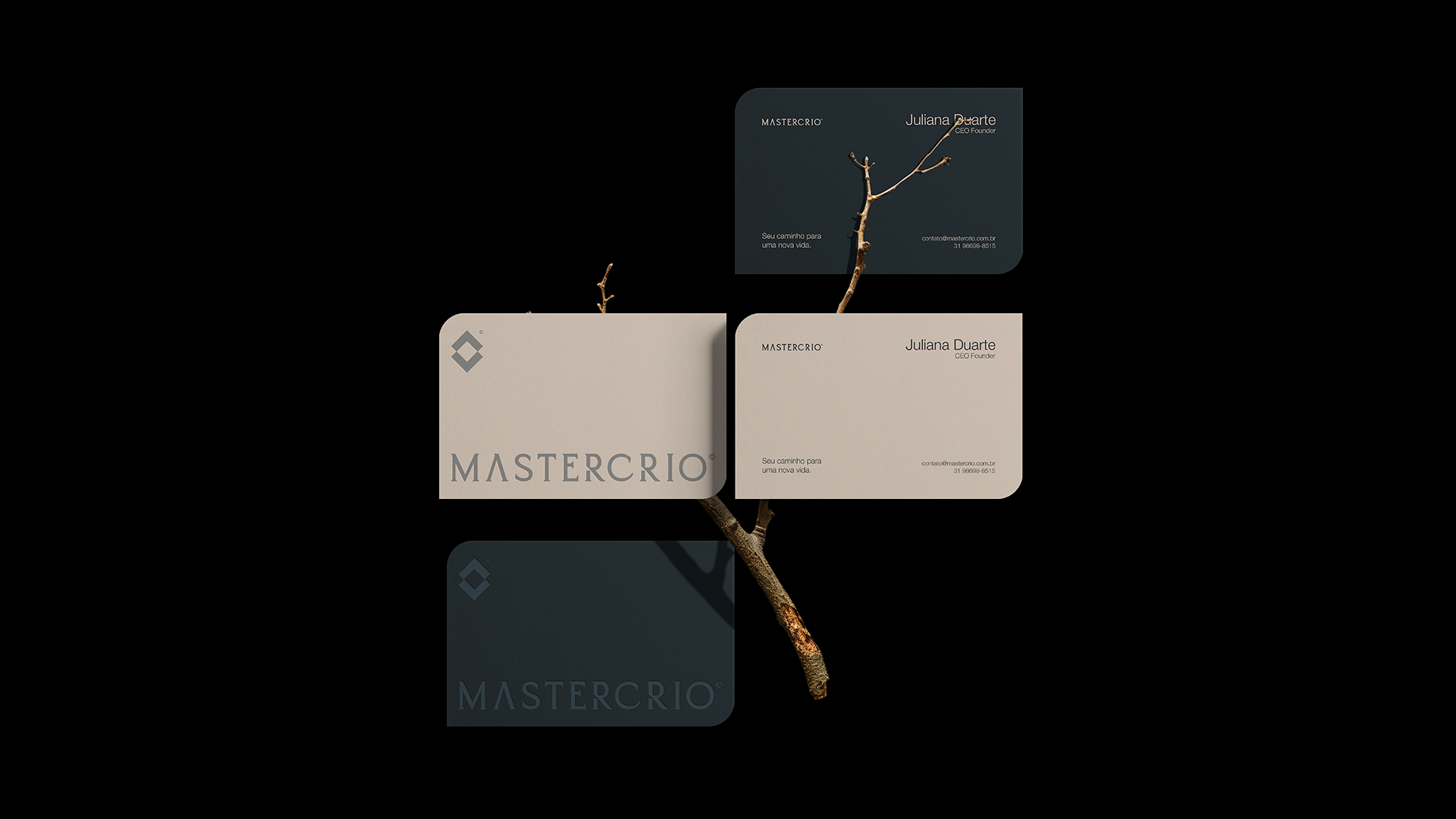
The symbol.
For the symbol I gathered a starting point which is a STAR, as the same symbolism already existed in the previous brand, so we decided to reuse it. From the star, we created the letter M (initial of the brand name) reflected on both sides. Next, we alluded to the silhouette of a body, the base material the brand works with.
The result can be seen in the video above.

The typography.
Com o símbolo finalizado, partimos para a personalização da tipografia da marca, assim criamos a partir de uma tipografia serifada o que será a tipografia principal da marca.
Estilizada em algumas letras a tipografia é forte, minimalista e moderna, transmitindo tudo que a marca desejava desde o ínicio.